
Search This Supplers Products:Road safety productstraffic signsolar traffic signsolar road studssolar signs
Traffic signs with a heart ask you to stop—in the name of love
time2017/07/26
Traffic signs with a heart ask you to stop—in the name of love
Road signs with an emotional appeal are gaining traction locally. And they’re going international.
Petulia Pugliares’s house sits on the corner of a suburban intersection in Wethersfield, Conn., sandwiched between two local elementary schools. The busy junction is outfitted with four stop signs and a crosswalk, but drivers tended to glide through it, oblivious to pedestrians, speed limits and standard signs that advised them to watch for children. Pugliares, an insurance agent, had seen plenty of collisions and close calls, and even had a few near-misses of her own. “Look, it doesn’t say, ‘Roll Slowly,’ ” she felt like shouting to motorists. “It says, ‘Stop!’ ”
One day in 2010, Pugliares came home to her husband, fed up, and said, “If people would just drive like their own kids live here, I think they would pay a little bit more attention.” Just then, she got an idea: She’d design her own sign. Days later, it appeared on her lawn, white block letters on a red background: “Drive like your kids live here.”
Neighbours and strangers alike were soon knocking on Pugliares’s door: Where could they get one? She printed off copies for friends in the neighbourhood and, soon, homeowners across town were requesting them, too. “It quickly turned into a statewide thing, then a national movement,” she says. Now equipped with an online store and a selection of different designs, Pugliares has sold almost 50,000 signs across all 50 states. Next up: Amazon.ca. “Canadian residents have really gained more and more of an interest.”
Pugliares’s project is part of a burgeoning global movement that’s taking on traditional traffic signage. Some signs, like hers, are homegrown: Last year, after a van struck and killed a seven-year-old girl in Toronto’s Leaside neighbourhood, the city’s residential streets became blanketed in signs, designed by a local father of three, that said, “Slow down, kids at play,” against the silhouette of a child’s face.
Other examples similarly appeal to emotions: Since 2007, WorkSafeBC has outfitted construction zones in British Columbia with notices that read, “Slow down, my mommy works here.” Some are whimsical: The town of Oak Lawn, Ill., accessorized its stop signs with messages such as “in the name of love” and “or I’m telling your mom.” (The bureaucrats at the state transportation department promptly ordered them removed.) Other signs are unnerving: In Elm Grove, Wis., radar speed signs detect drivers’ speeds and relay, in real time, how many days they’d spend in hospital if they crashed. And a few are downright eerie: The English city of Leicester installed life-sized child mannequins (imagine three-foot-tall foosball players) on the edge of school-zone sidewalks in an attempt to get drivers to slow down.
Though geographically and stylistically diverse, the signs have one thing in common. Rather than merely communicating basic information, or threatening drivers with possible punishments, they convey or elicit empathy. “Usually, the way we get people to follow rules is we wag our finger at them or threaten them,” says Daniel Pink, a bestselling American author who’s tracked the evolution of such signs. “All these people around the world are doing this, but they don’t have a name for it and they don’t even know other people are doing it.” So Pink coined a term: emotionally intelligent signage.
Pink first encountered this type of sign about 10 years ago, while he was jogging around his neighbourhood in Washington. On a church lawn, he noticed a sign that said, “Children play here. Pick up after your dog.” At the time, he was working on a book that was partly about empathy, and the sign seemed like an effective example of using empathy as a tool of persuasion. “It was simply saying: This rule is in place, and have some empathy for the people who might bear the consequences if you don’t follow the rule.” A little later, he noticed another sort of sign—one that instead communicated empathy from the sign-maker—while waiting in line at a museum in New York: “Don’t worry. This line moves really quickly.”
Pink posted the examples on his blog, and readers soon started sending in findings from all over the world. Now, with a sizable digital catalogue, he’s the de facto authority on emotionally intelligent signage. “Some middle-aged guys, their hobby is golf,” he says. “I collect emotionally intelligent signs.”
In 2007, at an international city managers’ conference in Pittsburgh, Pink spoke about his newfound passion. “It really got my attention,” says Kate Fitzpatrick, the city manager of Needham, Mass. “The No. 1 complaint our traffic advisory committee gets is speeding . . . People want signs that say: ‘Slow, Children.’ But they don’t work.” After returning home, where she was scheduled to teach a Grade 8 civics course at a local school, she asked students to make some emotionally intelligent signs. She brought the best to town council, intending to simply introduce the idea. “Just as a fluke, our highway superintendent said, ‘You could turn those into real signs,’ ” she recalls. “They took pictures of the signs and had them installed, and it went kind of crazy after that.” Out-of-state communities—including a town in Nova Scotia—called and asked how they might emulate the exercise. Now, instead of requesting standard “Slow, Children” signs, Needham residents request the student-created sign featuring a bright orange flame and the phrase, “Where’s the fire? Slow down.”
Needham never studied the effect of the signs, Fitzpatrick says, because they didn’t have the resources for a rigorous evaluation. Anecdotally, though, she says drivers have told her that seeing the hand-drawn signs prompted them to slow down. So far, no one has studied whether emotionally intelligent signage works any better than standard traffic notices. Pink contends this is largely because the phenomenon is still relatively new. “It’d actually be a very easy thing to test,” he says, “but I’m not sure that measuring emotionally intelligent signage is the best way for a professor to get tenure.”
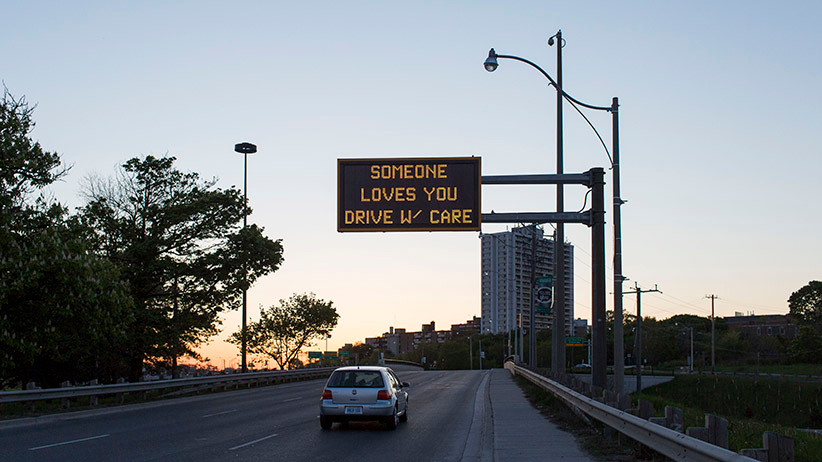
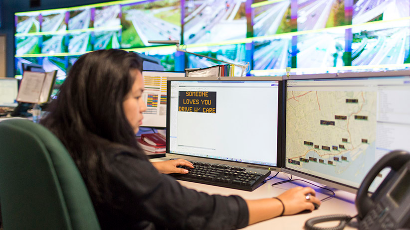
Nevertheless, the trend is spreading. In Toronto, drivers can catch a glimpse of emotionally intelligent signage on the Don Valley Parkway or the Gardiner Expressway. For two years, the city’s 18 overhead LED signs have displayed a selection of surprisingly graceful messages, such as “Somebody loves you, drive safely,” or, “Your life matters, don’t speed.” The signs show one of 60 public-safety messages when there’s no other relevant information to display: delays, lane closures, travel times, amber alerts.
“Rather than dictating to people—do this, do that—we wanted to give them the same message, but in a much more human or polite way to say, ‘This is how it’s going to help you,’ ” explains Rajnath Bissessar, manager of Toronto’s urban traffic-control systems. A handful of drivers have emailed him with their appreciation (a rare treat in an office that usually fields nothing but complaints), and the province has expressed interest in following suit. But, Bissessar admits, he’d never heard of emotionally intelligent signage; to his office, they were simply “feel-good” messages.
“It’s almost a ridiculous term,” says Dave Meslin, a Toronto-based artist and organizer who has championed better public signage. “Anyone who’s trying to communicate to another human will do it in a way that’s emotionally intelligent. It’s the default.” That there’s a label for these signs indicates just how terrible our current signage is, he says.
Case in point: the public notices that cities mail to citizens, print in newspapers and post outside potential development sites. In a 2011 TED talk, Meslin dissected Toronto’s notices—blocks of tiny, jargon-filled text on plain white background that seem to discourage, rather than invite, civic engagement—and asked designers across Canada to create local notices that people would actually read. To his surprise, the small town of Pemberton, B.C., heeded his advice and designed a colourful, easy-to-understand notice that encouraged citizens to attend a hearing about repurposing local rail yards as a public park. Meslin created a prize, the Dazzling Notice Award, and flew to Pemberton to deliver it; other Canadian communities—Vancouver, Ottawa, Hamilton and more—have won the award in subsequent years by following Pemberton’s lead. Notices are hardly the only problem, though. Meslin says there’s no shortage of public signage that could use a redesign: wayfinding, labelling, “all of it.”
Pugliares’s homegrown success story is evidence that an appetite for better signage exists, and she regularly hears from customers who tell her that the signs work. They may not solve all the world’s signage woes, but, “if we can save one child, we’ve done a lot,” she says. “And that’s what keeps us going.”